Color can make a space feel more open, inviting, or productive - all essential qualities for commercial interiors. But color psychology doesn't stop at visual tricks. It can influence human behavior in powerful ways - from encouraging collaboration to reducing stress. When paired with innovative tools like MYRO, an autonomous interior painting robot, these insights translate into environments that don't just look better - they perform better.
Let’s dive deeper into how color choices can enhance the functionality and emotional impact of commercial spaces.
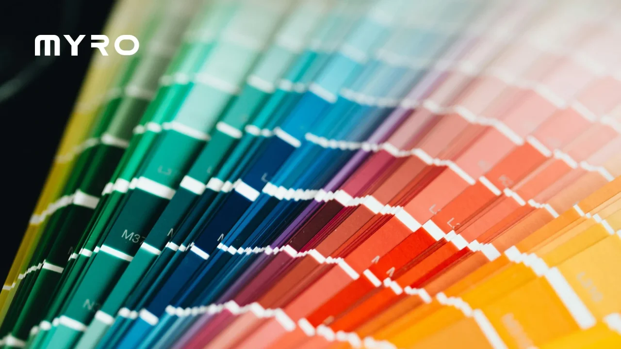
Color as a Behavioral Catalyst
Colors affect more than perception - they guide emotion and action. In commercial spaces, this can mean
- Boosting Collaboration: Warm colors like soft oranges, muted reds, and sunny yellows energize and encourage social interaction. Ideal for coworking areas, lounges, or brainstorming rooms, these hues support a sense of connection.
- Enhancing Focus: Cool, muted tones - such as slate blue, dusty green, or pale lilac - reduce overstimulation, making them perfect for workstations, private offices, or libraries. They create calm zones that minimize distractions.
- Promoting Trust and Security: Earth tones, like taupe, warm gray, and terracotta, ground the room. These colors are ideal for financial institutions, legal offices, and healthcare facilities, where creating a sense of safety and reliability is critical.
- Energizing Movement: In areas with high foot traffic, such as stairwells, corridors, or communal hubs, strategic use of bold accents-like red, electric blue, or goldenrod-can subtly encourage movement and alertness.
The Subconscious Impact of Color Placement
Color isn't just about what you choose - it's where and how you apply it that makes the real difference.
- Ceilings and Floors: While often overlooked, the top and bottom of a room influence how "grounded" or "airy" a space feels. A darker ceiling can create intimacy; a light-reflecting one elevates energy. Coordinated floor and wall tones extend spatial harmony.
- Zones of Influence: Create psychological zones without building walls. For example, using warm neutrals in collaboration corners and cool blues in focus zones helps guide behavior naturally - no signage is required.
- Directional Cues: Contrasting hues along pathways or doorways can intuitively guide people through unfamiliar layouts, enhancing both flow and experience.
Precision Meets Psychology: Why Application Matters
Understanding color psychology is step one. Ensuring it's executed perfectly is step two - and that's where smart automation tools like MYRO elevate the outcome.
MYRO's autonomous paint application ensures consistency across every wall and surface, honoring the designer's intent. No uneven lines or mismatched tones - just smooth, seamless color that communicates exactly what it's meant to. With programmable control and real-time adaptability, MYRO helps bring psychological design strategies to life - effortlessly. Its color psychology is delivered with robotic precision.
Final Thoughts
Color is more than just decoration - it's a behavioral tool. When used intentionally, it creates spaces that do more than function: they speak, influence, and inspire. And when combined with innovative technology, your design vision is realized with the accuracy and consistency it deserves.
Whether you're creating a collaborative hub, a meditative office, or a sleek showroom, let color psychology - and the tools to implement it flawlessly - shape the outcome.